To create a memorable impression, sometimes one well-thought-out poster is enough. It may seem unbelievable, but a bright visual composition and creative design solutions can catch the eye even on a crowded street. Will the poster only remind people about an upcoming event, or will it speak to emotions and offer motivation and inspiration? Interesting design, the right accents, and smart poster production can be the solution to stand out in any market.
1. A Strong Visual Focus
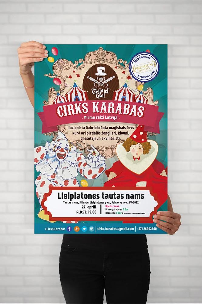
One of the most important keys to a successful poster is a clear visual center that grabs attention from the first moment. A large, clear image or a symbolic element helps create emotions and sparks curiosity. Sometimes one main figure is enough to speak to the viewer, but color choice and contrast are also very important. For example, bright accents can highlight what matters most, while neutral shades create balance. In this way, large elements and text blocks do not compete with each other, but work as one whole.
2. The Right Information Hierarchy
For a poster to be not only beautiful but also effective, an organized text layout is essential. Poster production does not mean only printing – it also includes strategic placement of information based on marketing goals. The main message or slogan should take the most visible place, followed by other details. For example, the date or location can be highlighted with a larger font, while the purpose is explained in a smaller text block. This approach keeps visual order and ensures the viewer gets the key information immediately.
What will be the next step to keep improving the poster design and leave a real impression?
3. Consistency of Colors and Typography
To make a poster design truly stand out, it needs a clear color palette and well-chosen typography. Bold color combinations can create a strong visual impact, but too many bright colors can overload the overall look. Choose a few dominant tones and combine them with neutral shades to keep a healthy balance. Typography plays an equally important role: one or two fonts are enough to create a consistent look and avoid confusing the viewer. A good system of colors and lettering combines visual style with function and also ensures readability.
Poster production often also means keeping accurate reproduction of red, green, or blue shades, and this depends on printing technologies. For the poster to keep its clean feeling both on screens and in physical form, it is important to understand the differences between RGB and CMYK color systems. Well-chosen colors and fonts help create emotion and allow quick, natural communication with the viewer.
4. Original Design and a Story
Some people say: “A poster should be like a small story that speaks in two seconds and stays in your mind.” This effect is achieved when every element works together and delivers a strong message. When the design tells a story, the poster gives the viewer a chance to imagine a situation or connect with the idea. Even popular symbols, if adapted creatively to the campaign message, can create a unique and innovative look. The best solutions are those that can entertain and educate at the same time, so the viewer feels confident about the main idea.
Often, using real creativity becomes the key factor that will not be lost even among many colorful projects.
5. A Dynamic Approach to Poster Production
Few people can deny that adding interactivity or an illusion of movement can be a strong technique when used correctly. In today’s advertising environment, poster production is no longer only static printing – with innovative materials and very expressive graphics, you can create a design that “moves” in the viewer’s eyes and attracts extra attention. Replacing simple elements with a mirror effect, changeable parts, or even electronic lights keeps intrigue and makes people stop for longer.
It is often useful to experiment with materials, for example using unusual paper types or combining printing with transparent elements. The approach should stay clean but bold, so the final result is pleasant both to the eye and to the touch. When design is combined with the right technical finishing, it can become the foundation of an even stronger advertising campaign where the message stays in memory.
Successful poster production means that even before printing, the artistic solution is developed very precisely so the “conversation” with the viewer is not boring. If all five design aspects are balanced, the poster invites action and creates emotions over time. Colors, font, story, and dynamics together create a meaningful message that can stay in the mind. The features should be strong enough so that a few seconds on the street or on social media leaves a valuable and noticeable impression.
But is it not time to show creativity and improve brand visibility? By choosing the right material, image, and layout, poster recognition can grow very fast. If innovation and precision are combined in the design, no viewer will stay indifferent. The biggest difference between effective and ordinary print work is often hidden in a unique story and an attractive look. Who would not want to make a campaign unforgettable and more needed in the market?